May 9th, 2023
I'm Listening to: Mr. Crowley by Ozzy Osbourne
I'm feeling: Distracted
I'm playing/watching: Brutal Legend
Well hello, I mentioned this on my neocities profile page and wanted to expand on this in a blog for the sake of throwing my thoughts out more. Basically for a while now I have been wanting to redo my website layout. Not just for the aesthetics, but also because its a bit broken and the code is old. I settled on this look not long after the first real design but even then I was kind of just rehashing the original code... with very little improvements on it. I made a tumblr post where I pointed out some of the issues on my website right now. I haven't gone back into coding website stuff in MONTHS so i am rusty, but i really really want to take my time and make sure what I do next works and functions better.
Soooo what do I plan on doing? Well I have the thought to "de-make" my website. What do I mean?? The idea is I want to really nail down the "functional" part first and the pretty graphics second. Before I wanted to get into the visual quick but it was like I was juggling that and the function part randomly. I would want to do one thing and then I would hop over to the other, often getting more annoyed by the code part and not focusing on it very much, thus resulting in very restricted code where I didn't learn more about a better way to do it. *Instead* I want to do the function and then the visual. I want to "de-make" my website in the sense of tearing it all down to its barest form. I wont LITERALLY be deleting my website as it is btw, there will be a whole back up, of course! But I want to just do like, the HTML and bare bones CSS. Just come boxes and links, menus or animations-- but without all the graphics I want to actually have. All the visual stuff I expect to make as a whole png/jpeg background where those originally obvious divs/containers are just invisible! But getting it all laid out and 'naked' makes it easier for me to understand before I do that, you know?
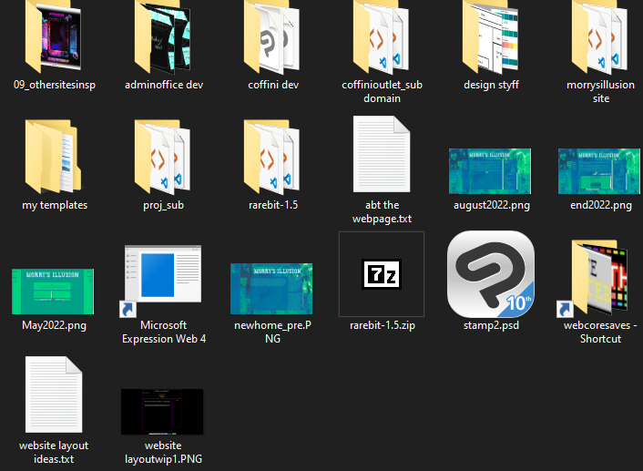
I am VERY organized with how I handle my website stuff-- example of my folder layouts...


In that regard I will I will be making an ENTIRELY seperate folder on my PC to start coding my new website, and my existing one will stay up as it is until I have something functional (but won't nesecarily have the visuals done).
I don't have a solid visual design for my home page yet though. I want to take time to really get all the assets figured out and the overall theme or I know I won't really get what I want, and I don't want to rush. But I did make some plans for changes in the design for Coffini Outlet! For those unaware the website name was pulled from a location in Regular Show, and so I wanted to remake the layout with a stronger focus on visuals referencing that episode/location. All the colors are pulled from screenshots in the episode. I really really like the idea here, and I decided this would be the first one I tackle in full because the layout is ultimately very very simple... Just need a sidebar for old entries, and a large area for the writings. So, hopefully I can start on this one soon.

**The image states no sidebar but I do need to figure out how I want to fit in the TOC for all the old articles. Hoping itll stay in that main box.
Yeah! So. These are my thoughts on how I wanna get to redesigning my website. I am SO busy but I really want to get back on this...
Want to hit me up about this blog? email me!