May 7th 2022
Hello! Today I am writing up a more simple blog, as I have been kind of all over the place too much to write a lot of new pages. I want to make sure I do things other than stare at html all day so I am taking a minor break from all the bigger updates I just made recently.
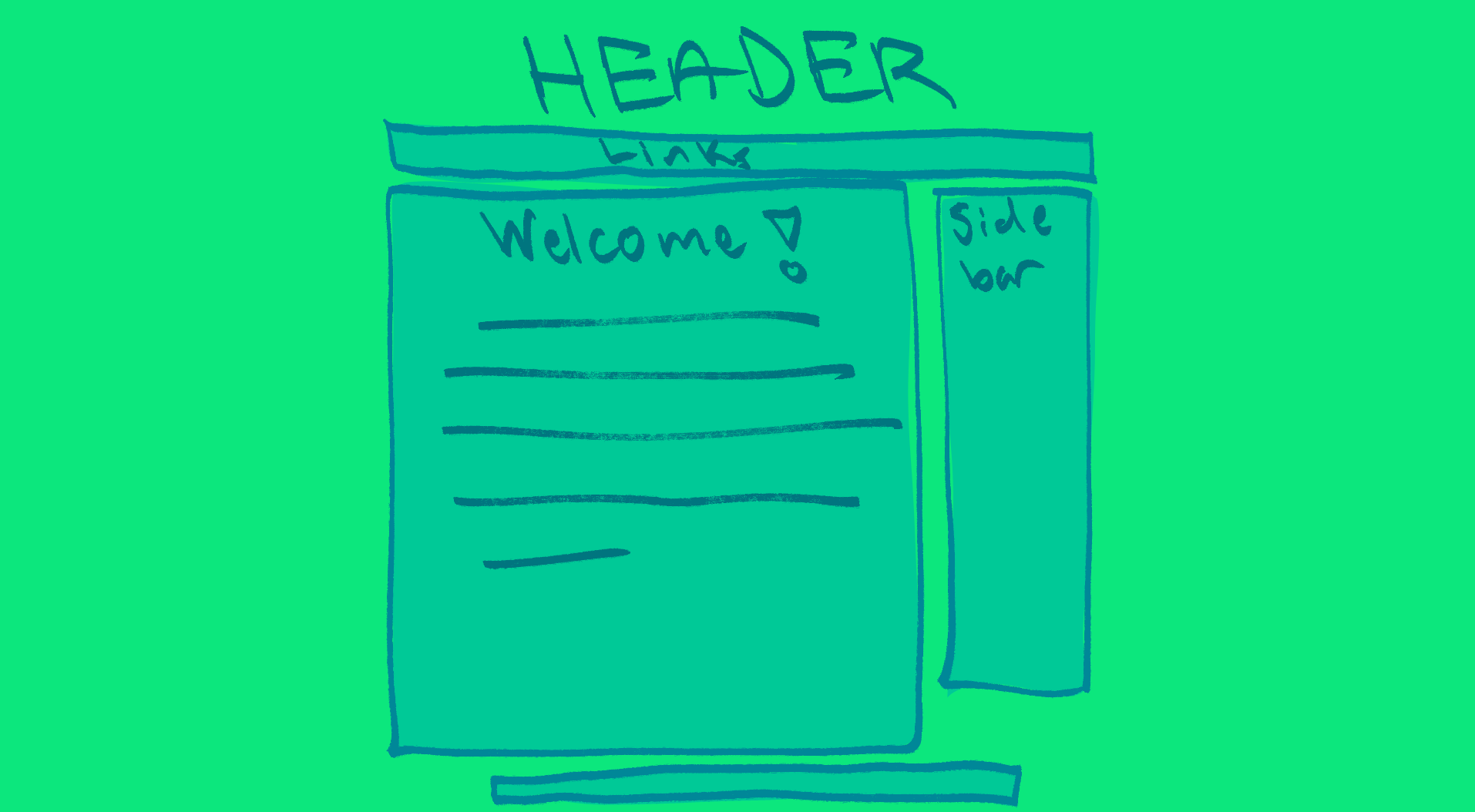
So, I thought it would be neat to show some of the process I had when going about the website's design so far. I have a ways to go before I fullu acheive what I have in mind, but because I am a visual artist first I made various thumbnails to picture it before I even started coding.
Here is the first thumbnail I made:

This one was drawn over my very first look of the web page initially inspired by Seth's World, but I quickly wanted to shift to a look with two large sidebars more inspired by pages like Lulu in Cyberspace or Teddybear Halo.
which started to look like this:

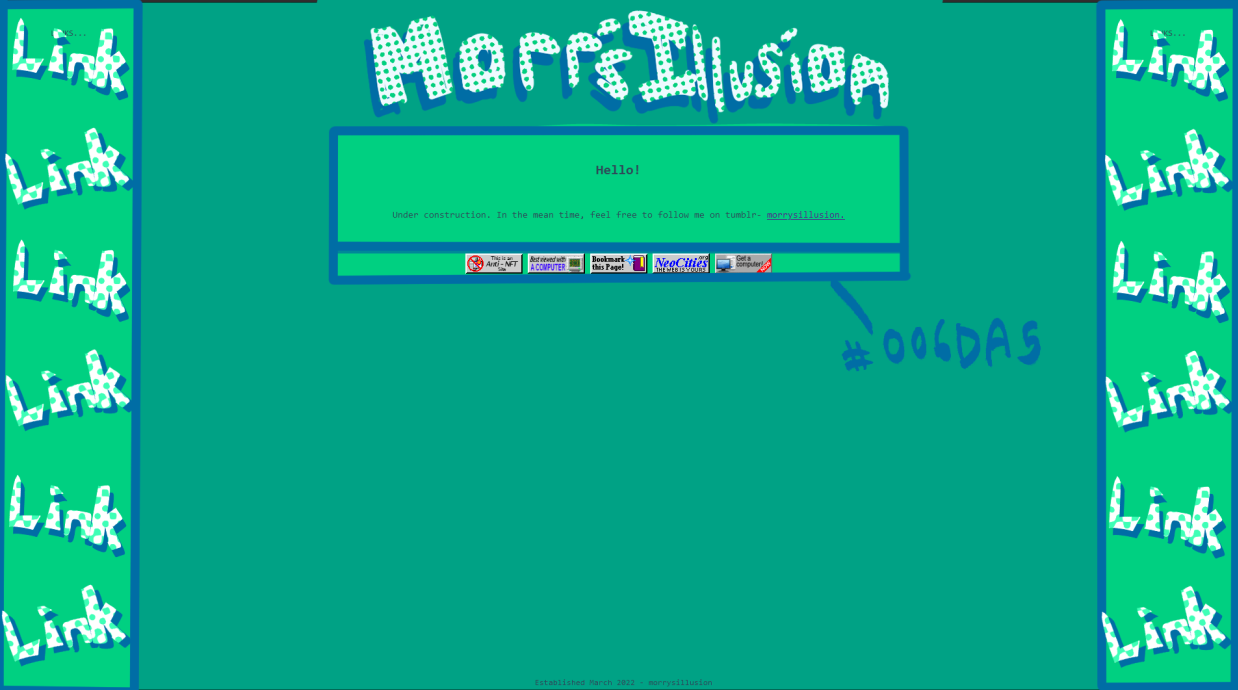
But eventually I started to sort out better colors, and we got here...

The colors were something I didn't think I was going to stick with, but they have grown on me. As an artist I love figuring out color but with no history in design like this it was a struggle finding an array of colors I even liked... I came up with various pallettes and now refer to a set of two similar pallettes- the bottom one being the main pallette, the top one being for small additions, details, accents that seem "close enough" as to not be unfitting from what the website is.

After I had those colors down I wanted to figure out the look of the text. So i quickly thumbed out some titles/headers by hand- and while I currently have my header in font i DO plan to hand draw it... I just havent had energy, and again... text/hand drawn fonts are Not my thing at all so who knows. All I knew was that I wanted a rough look with a simple pattern. The site's colors fit well with the harsh white I think, making it stand out but not in a way that strains your eyes. Eventually the website background will be an art collage, which I hope will tie together the varied textures in the header text too.

(yes i missed the Y in my name...)
So yeah! Thats all the thumbs I have. And I still have a ways to go with this site. But personally it helped a lot for me to visualize my website like this before I got into coding it all, even though I was confident in html, I felt directionless without a proper visual of my goal. I also had a text doc where I did a similar bullet point list of the layout described in words which may be useful for non-artists to consider. I compiled a short list of websites I wanted my site to look like as well.